RESOURCES FOR AUTHORS
Here you’ll find a few words of advice about cover design and working with a designer, some articles about good cover design, and some useful tools to help you along your self-publishing journey. If you know of a helpful tool not listed here, I would love to hear about it. Send me a message and share it.
MY ADVICE ON COVER DESIGN
Advice on designing a successful book cover is all over the internet. And it all pretty much says the same stuff: make the title large, use a drop shadow, don’t use more than two fonts, etc. A lot of the advice out there is too specific. It doesn’t take into account that not every design solution works in every situation. So rather than giving you rules, here are some general principles you should keep in mind when designing a book cover.
VISIBILITY
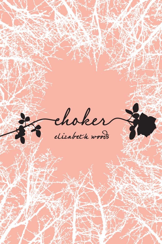
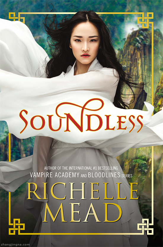
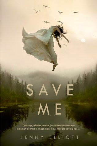
Your title needs to be visible in a variety of different sizes and formats. Most of the advice I’ve seen around the internet will tell you that, to be readable, your title needs to be big. But that isn’t necessarily always the right answer, and it certainly isn’t the only answer. For instance, you can make sure the cover image isn’t too busy behind the title, even subtly fading the image or photo elements behind the text. You can create contrast by putting a lighter title on a dark background (or vice versa), or using complimentary colors for the title and background (colors that are on opposite sides of the color wheel). You can also make your cover more readable by not crowding it too full of text and images. Keep it simple.


FOCUS
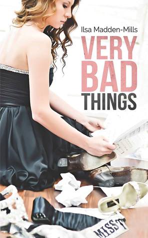
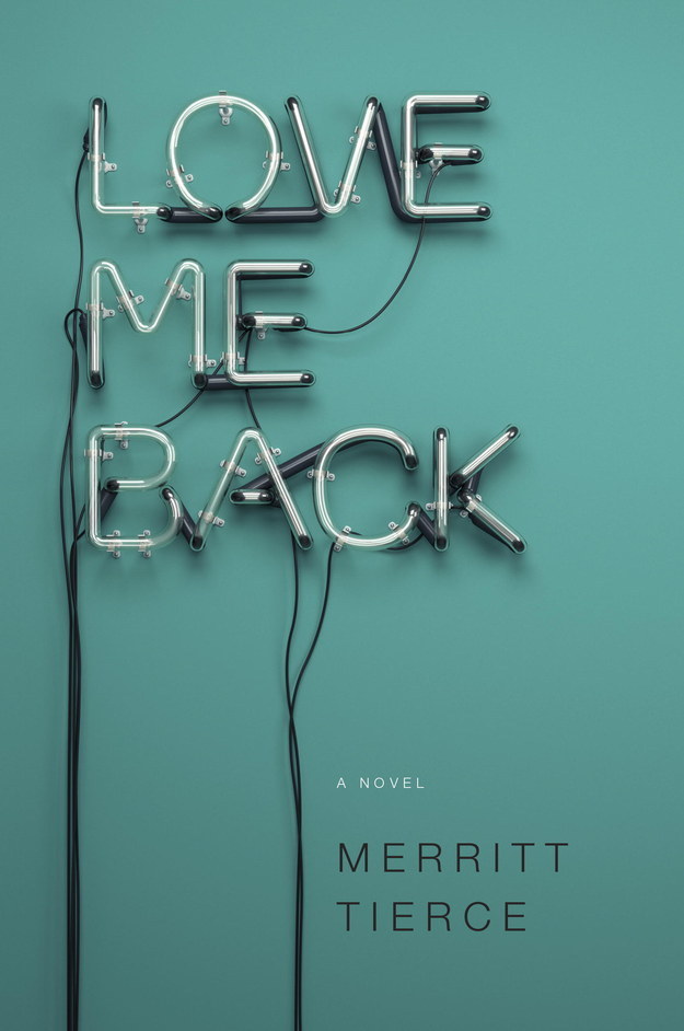
One bit of advice I see a lot and I completely agree with is to choose just one idea for your cover and make it the focus. If you try to include every major character, several symbolic objects, the place where the big climax takes place, and every other thing you’ve deemed important to your story, you’re just going to end up with a mishmash that no one can understand. You’re better off choosing one of those important things and really making it count.
The same goes for text. If you’re going to include your title, a subtitle, a huge author name, a series tag, a review quote, and a line from the story on your cover, and you want all that text to be as readable as the title, you’re going to have a jumble that’s hard to decipher. The title is what’s most important. Make it the focus.




COMMUNICATION
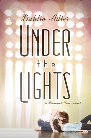
Book covers are a communication tool, and it’s important to think about what information you want to convey about your book. A common misconception is that the purpose of a book cover is to tell potential readers the premise of your story. But it’s not. Most of the time, that’s not even possible. You can jam your cover with imagery or try to illustrate an entire scene, but you won’t be able to control how someone else interprets that information. And if your details are too specific, you may confuse people rather than inform them. What potential readers are looking to take away from your cover is the genre, the mood or tone, just a hint of what your book is about, and whether or not it’s worth their time to learn more.



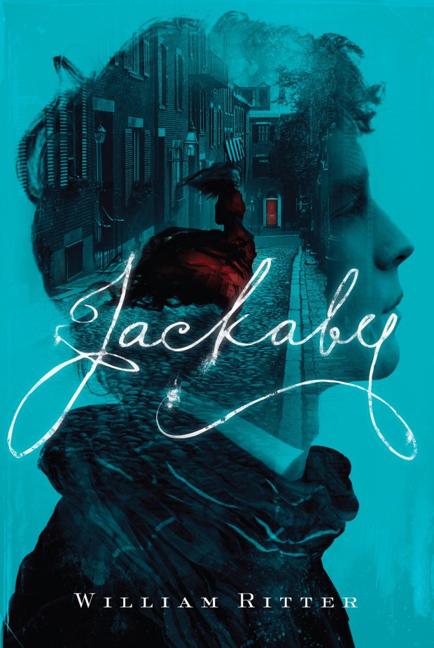
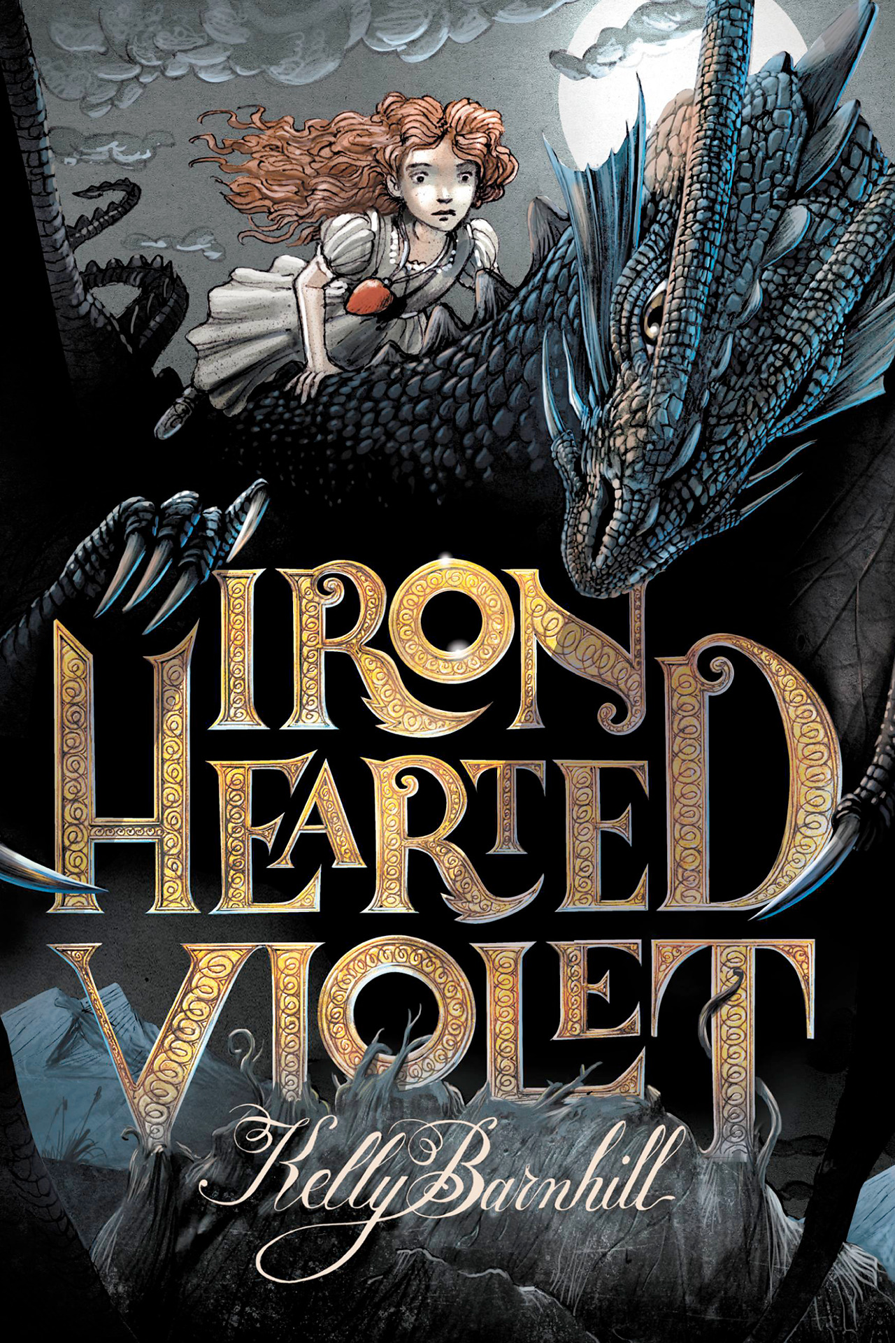
IMPACT
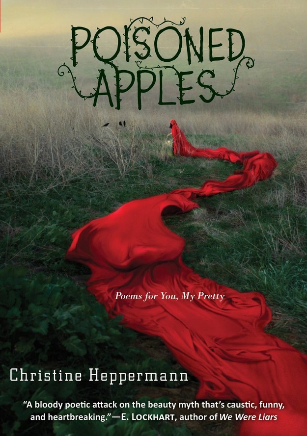
When a book has a poorly designed cover, it tells the reader (if only subconsciously) that the story inside may be poorly put together as well. A well designed cover instills confidence and makes an impact. And that’s the real purpose of a book cover: to make an impression, to make people remember it. And what people are most likely to remember is not an author’s name that they’ve never heard of, or a detailed scene full of symbolic imagery… it may not even be the title. What they’ll remember about your cover, if they remember it, is the design and the impression it gave them.
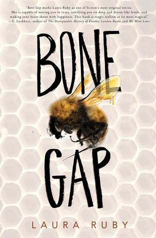


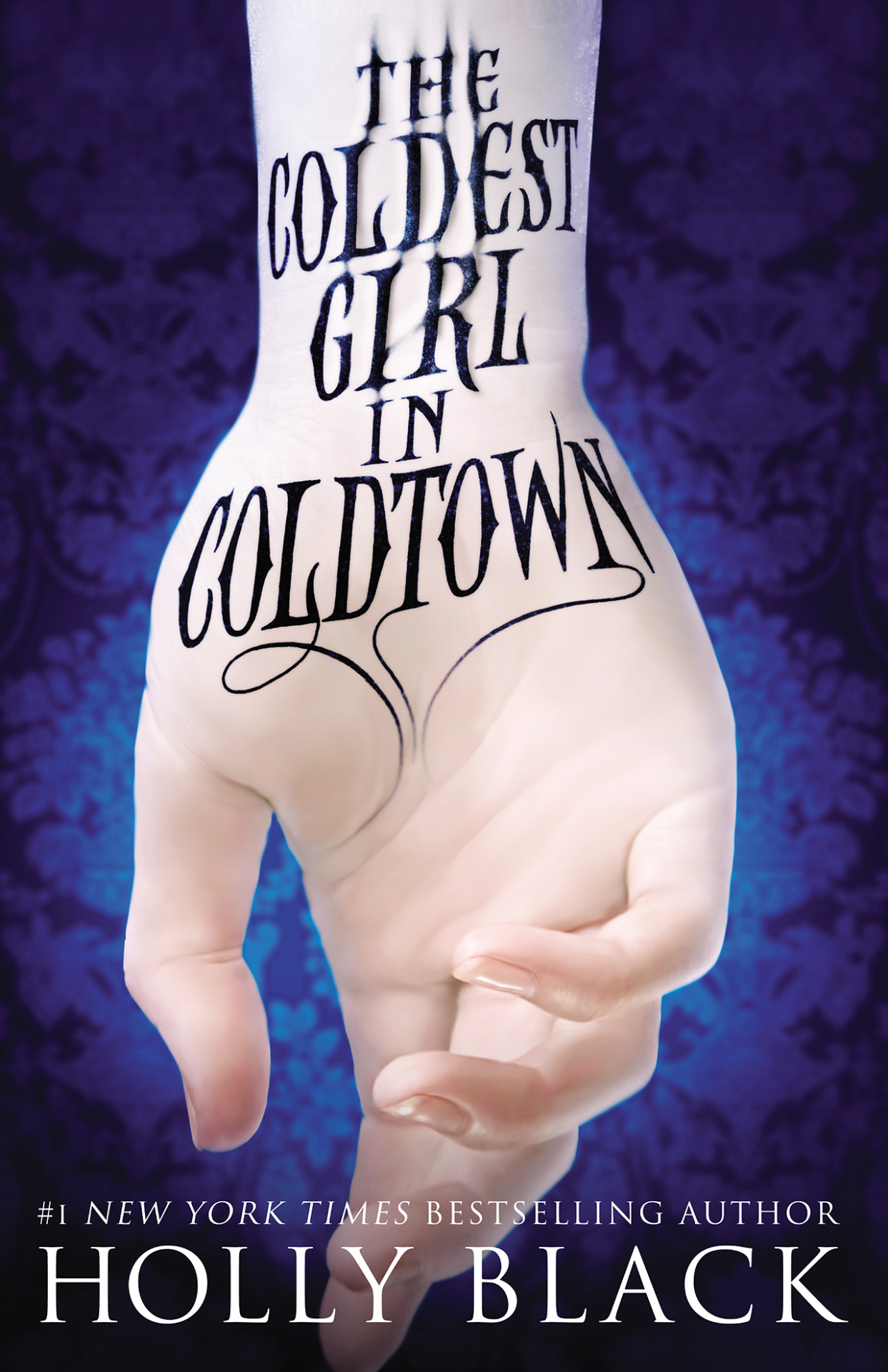

This isn’t everything that goes into designing a good book cover, but these four principles – visibility, focus, communication, and impact – are what I feel are most important. And remember, for every rule, there’s a reason to break it. That’s why it’s so important to hire a professional. Designers are trained to know when to break the rules.
ARTICLES ON GOOD COVER DESIGN
-
10 Lessons from Veteran Book Cover Designers
I like the point that “A book cover must be both art and commerce”. A good book cover has to have both function and aesthetic. One without the other won’t sell your book.
-
6 Expert Tips on Designing a Great Book Cover
“Instead of three or four story lines, two characters, eighteen scenes and one plot twist clamoring for attention, pick one strong theme for the cover.” Really great advice. I love the points here about simplicity and balance.
-
Chip Kidd: Designing books is no laughing matter. OK, it is
This TED Talk is really entertaining. I like that every single one of his covers expresses one big idea from the story, instead of trying to tell you the whole thing. I also think he makes a good point about “treating your audience like a moron”.
-
Yes, We Really Do Judge Books by Their Covers
This article does a really good job of explaining why having a good cover design is important. Elements listed as important: “simplicity, a clear promise, a professional design with layers and smart use of color, readable text, and appropriate targeting”.
-
Four steps to create a great cover for your self-published book
Creating a mood board is a great idea. It’s also a really helpful thing to show your cover designer to communicate what you want. There’s also some good advice here about finding inspiration from other covers.
-
Top 8 Cover Design Tips for Self-Publishers
“You could think of your book cover like a billboard, trying to catch the attention of browsers as they speed by.” This is a great analogy. And I like what this post had to say about choosing one focus for your cover.


