We Heart YA
Identity Design, Print Design, Web Design, Apparel Design
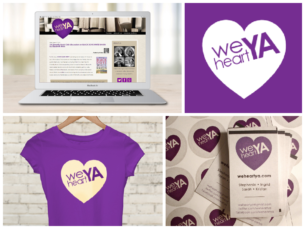
Branding I did for We Heart YA, my writing critique group, book club, group blog, and friends. This is an evolution of our old logo, which I also designed but was never happy with. I wanted something bold, simple, easy to read, and fun.
Here’s a look at what the logo and the website looked like before:
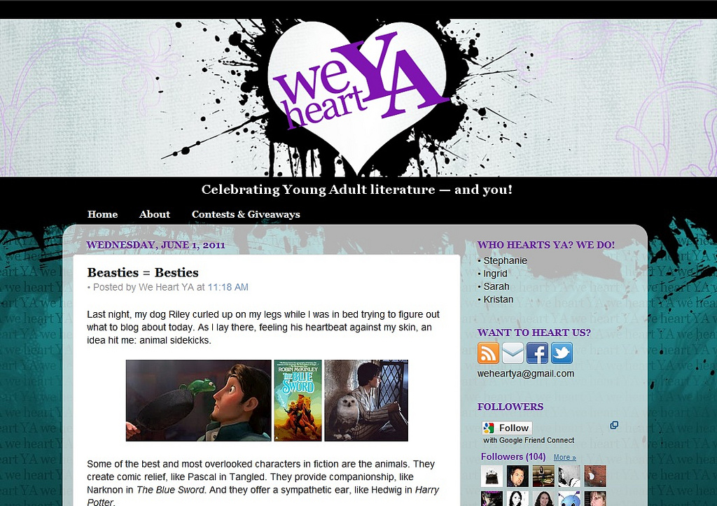
I still have really fond memories of this design. It was the first time I put my dabbling in web design to work. In the few years after setting up the first version of the blog, I learned so much about web design that I was itching to redesign it.
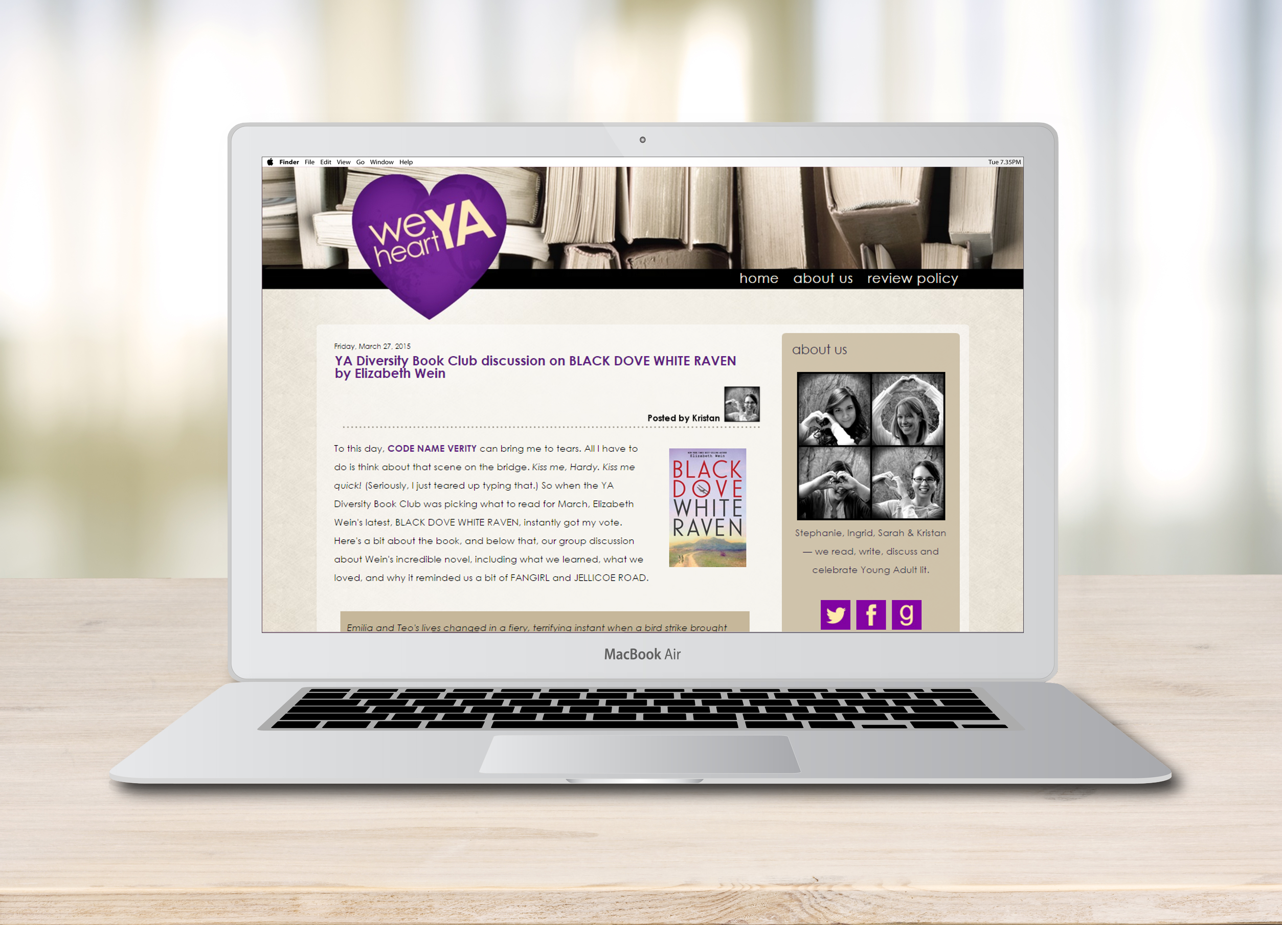
After:
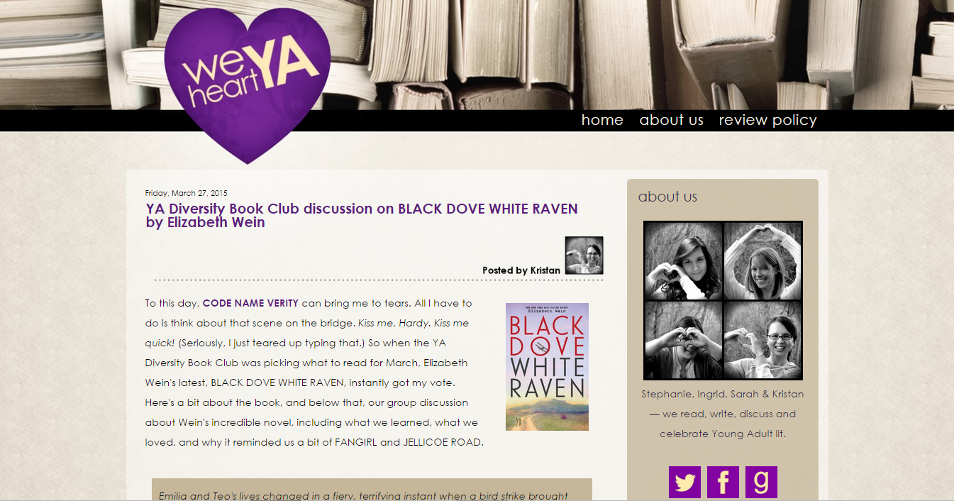
I went from having to rely on a premade template, morphing it into what I wanted as best I could, to designing my own template and having complete freedom to create it the way I wanted it to be. I ended up with a design that looked a lot cleaner and more mature.
Before: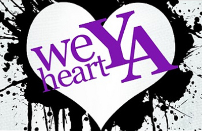
|
After: |
The first “logo” was really just a header image that ended up sticking and being used on all our social media sites. The new logo still has the same spirit as the old one, but it works much better now by itself and as branding for promotional materials and social media.
|
|
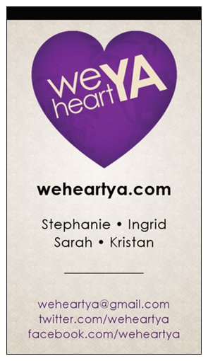
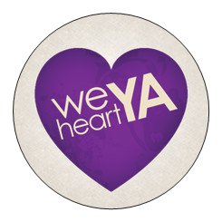
A business card and sticker design, using the same branding. We hand these out at events or mail them with giveaways and contest prizes.
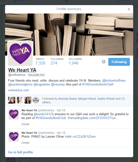
Our twitter profile with the same branding.
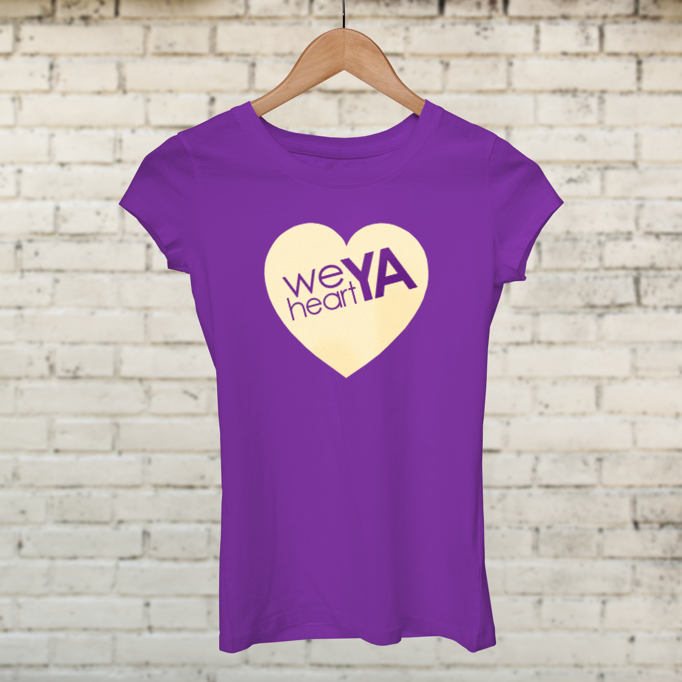
A t-shirt design I did for the four members of We Heart YA and possibly to sell to readers and followers someday.


